Well I’ve found what I think is a ‘softer’ look so we’ll stay with this one for a while 🙂
The title and header have been rearranged however there is still a lot of white space there still (which for some reason bothers me) – does it look softer than the previous one i.e. the one I had there yesterday?
In a comment on the last post Angela mentioned seeing advertisements – another blogger had also alluded to this a while ago but I didn’t think any more about it – SO could you let me know if they are still there. When I log out and have a look there’s nothing there so it could just be a haphazard arrangement.
I vaguely remember WordPress saying something about them to keep the site ‘free’ (and yes I know blogger is free but I’ve been there done that and it ended up in tears 😦 ) so if all else fails and they still appear I might (might) have to pay to have my own domain. Hoping it doesn’t come to that.
As they say – just looking at life in a different way should help. Here’s hoping it does.
Frustration point here at the moment – wondering if….. well….. we’ll have to wait and see 🙂

Cathy, I know nothing about WordPress. As a blog, it looks nice. There are two ads, though.
LikeLike
Because I’m new to your blog I have forgotten what it looked like before but you have a good clean look happening which is always good in my book and I don’t see any ads although there is a little icon labelled “advertisement”
If you made you background a very light colour (grey or aqua maybe) you would have an even softer look (if you wanted)
LikeLike
It won’t show the ads to you as you are logged into your blog. If you open your blog in a new browser where you are not logged into your blog, provided you don’t have any ad blocking built into that browser you will see the ads. I see three in a new browser, but I routinely use ad blockers so I don’t see them in this window. 🙂
LikeLike
I don’t see ads. I can on some blogs and had assumed my ad blocker wasn’t working. On yours it seems to be.
There is a lot of white – but it makes the text easier to read.
LikeLike
I like the new look, and I don’t see any ads. That surprises me, because I do when I look at other free WordPress blogs. When it happens I just ignore them.
LikeLike
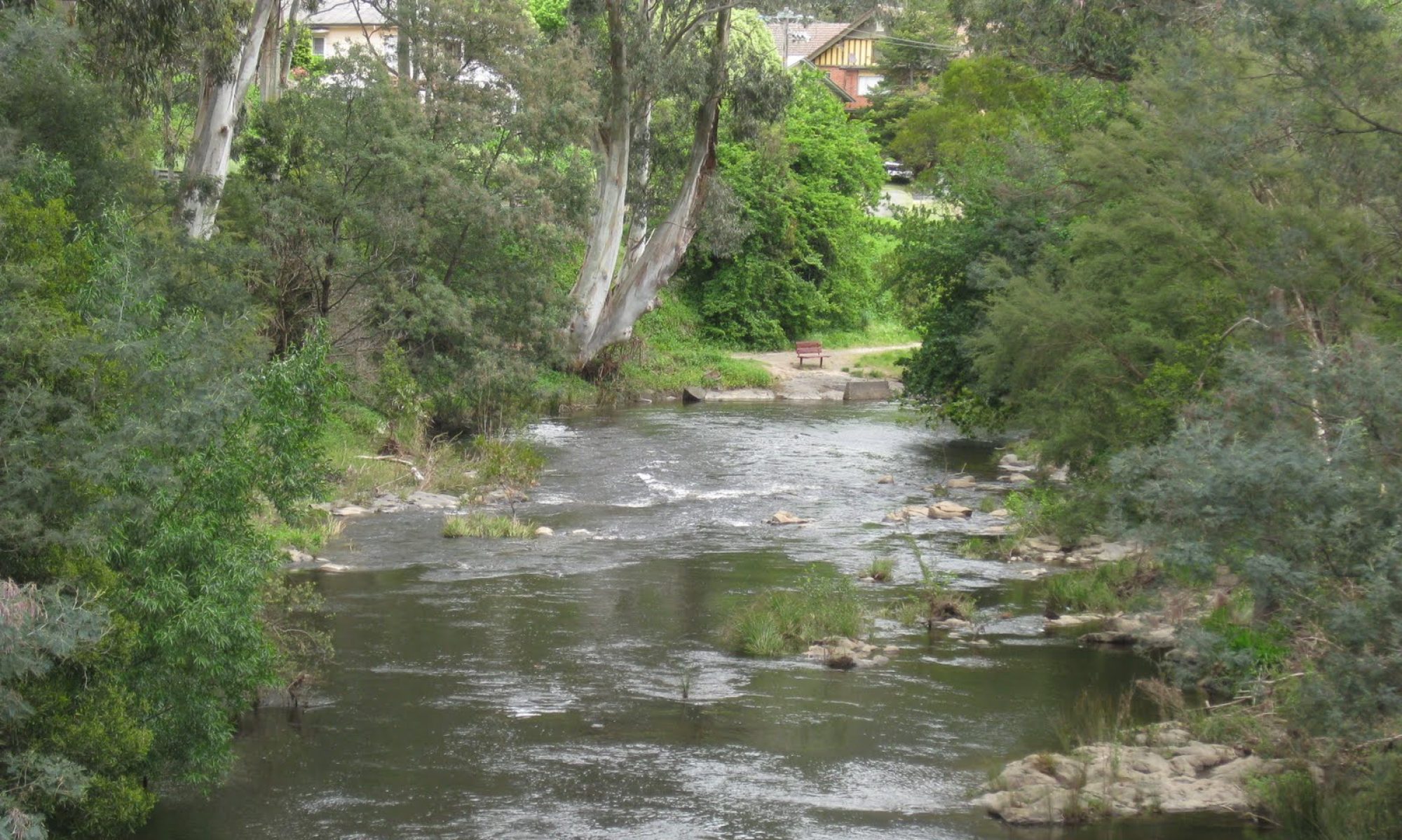
I am not keen on the white background but I love the header photo. I have visited the weir but I did not recognise it. I don’t think I have seen ads on your blog.
LikeLike
Ah, it had forgotten who I am and I had to fill in the details. No problem.
LikeLike
Did not see any ads. Look good.
LikeLike
I can’t see them now. So hopefully they are gone
LikeLike
There are no adverts here for me today and like you I have a free wordpress site and they do say there might be ads on it to help them cover the cost of the free site. I have seen them very occassionally on some blogs, but they were very much geared towards me , so I suspect they get linked to things I have looked up on the internet, they were absolutely nothing to do with the blog on which I saw them. Knowing what they were I ignored them!
I guess it’s only fair to wordpress they do this.
LikeLike
Love the header. Crisp and cool for our northern summer. No add that I can see either
LikeLike
It’s just my taste but I prefer sites with plenty of blank space. It’s why I use the theme I do – much easier to read the words without loads of clutter in the way! No adverts for me, but as others have said WordPress do make it clear that they may display the odd one. A small price to pay for hosting the site for free, I think.
LikeLike
I can easily read your entry, and since that is what my visit is all about, I think it is a great design. So many sites I visit have poor contrast, so I have to copy and paste the text into another program to get the contrast, and enlarge the text so I can read it. Old eyes I guess, but I am very appreciative of good contrast when it comes to reading text.
LikeLike
Easy to reads, which is what counts with my eyesight.
LikeLike
I like this. You are right—it is a softer look. I don’t see any ads. Kudos for trying something new. You have inspired me to change my header this summer—way overdue!
LikeLike
Looks good.
LikeLike